Introduction to Digital Design
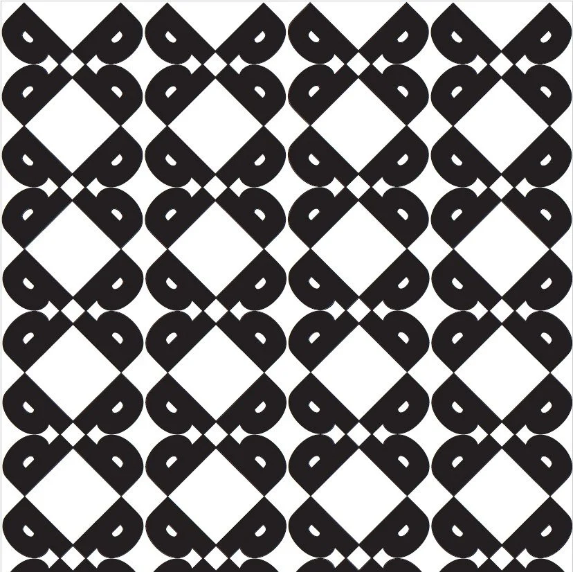
Type Patterns
This exercise helped me analyze a font and choose a letter to create a pattern.

Coloring Page Design
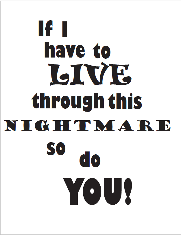
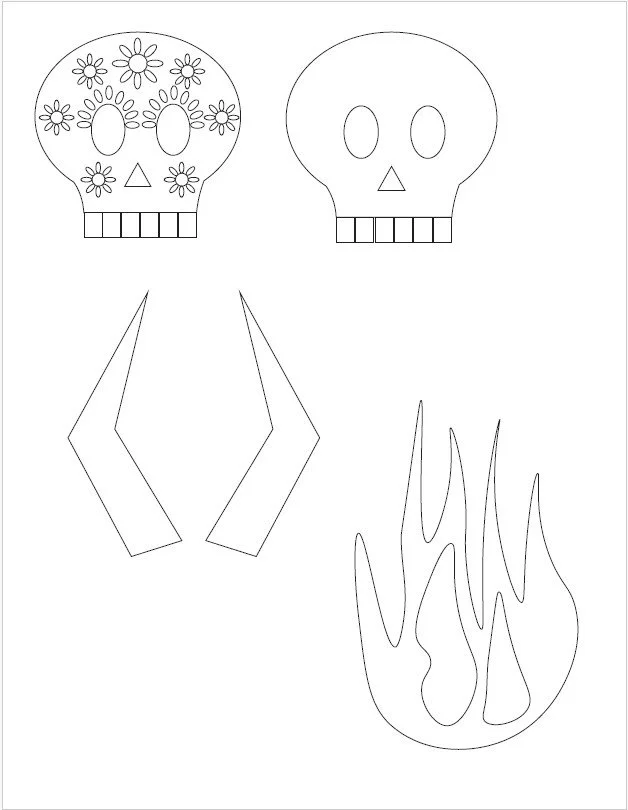
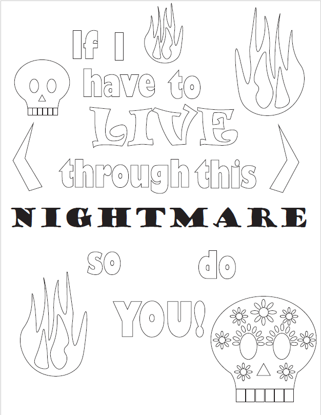
In this exercise, we used a quote to develop a coloring page. I chose to use a cheeky quote that it meant to encourage someone. I chose skulls and flames to fit with the dark humor.
Postcard Development
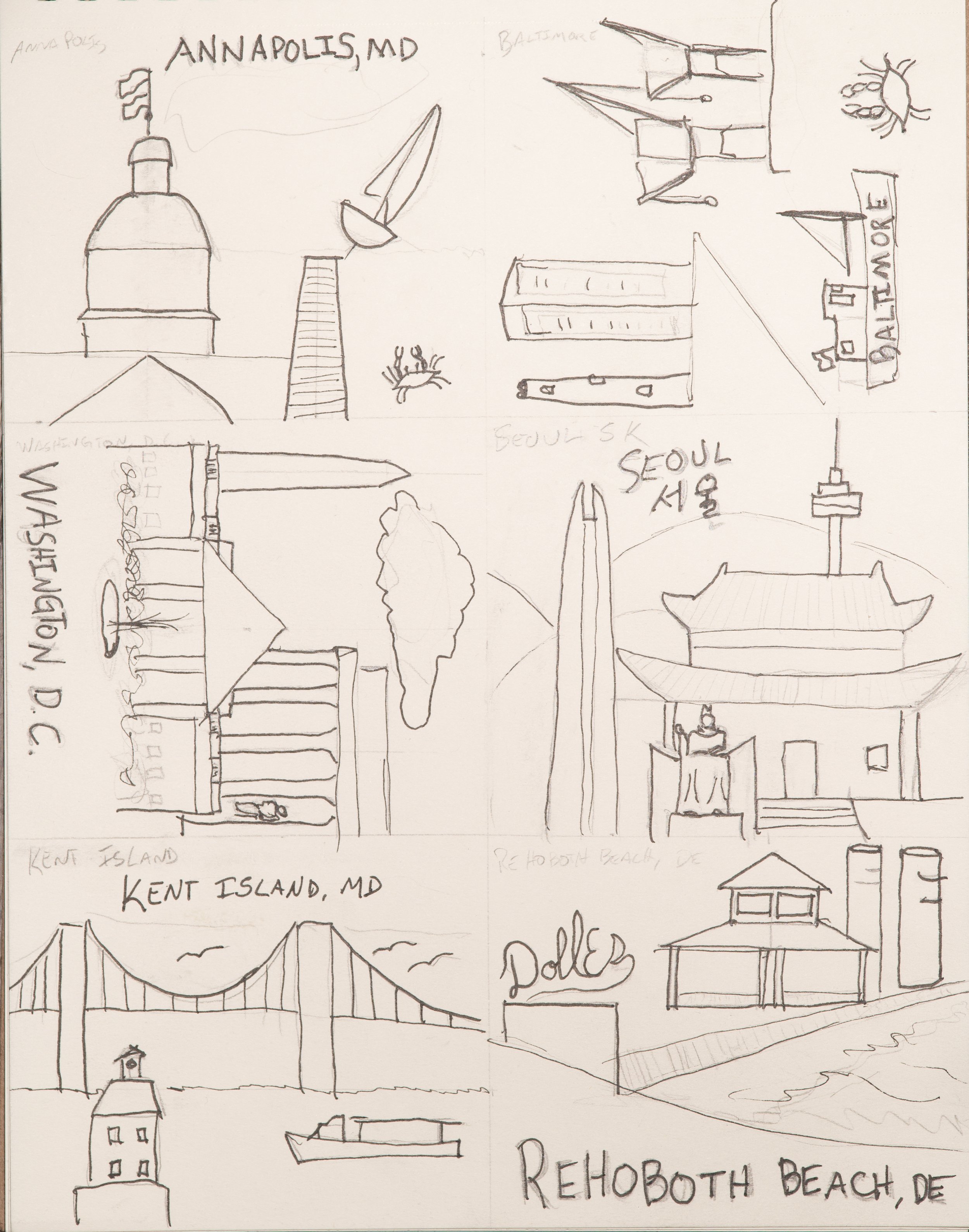
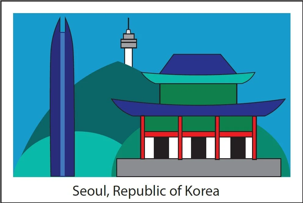
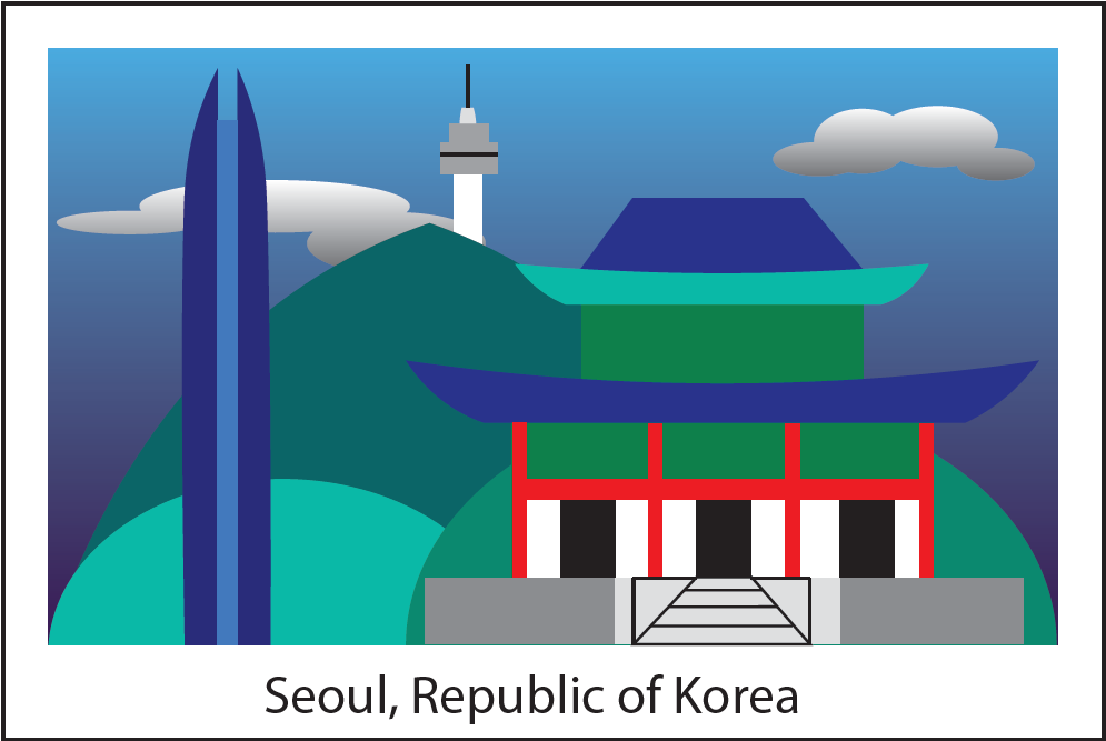
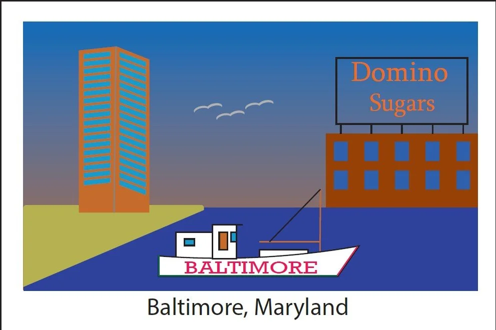
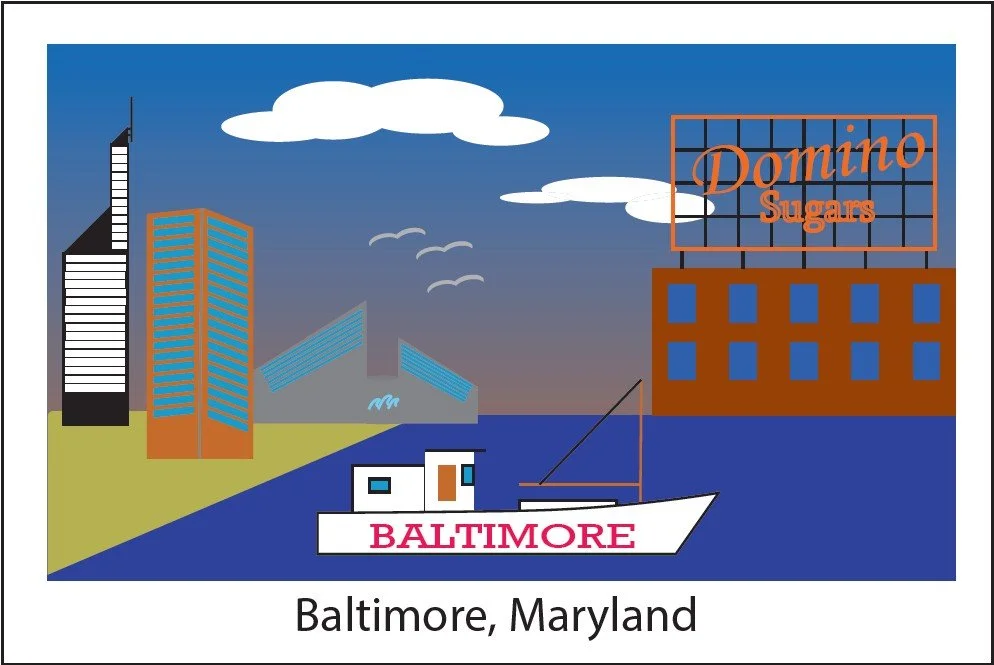
In this project, we were asked to take a idea from concept to finished project. It was a good experience and forced me to slow down and think about how to design something from scratch.
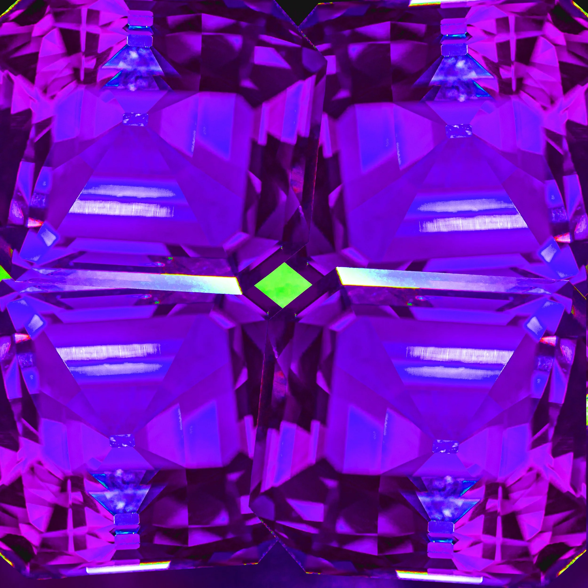
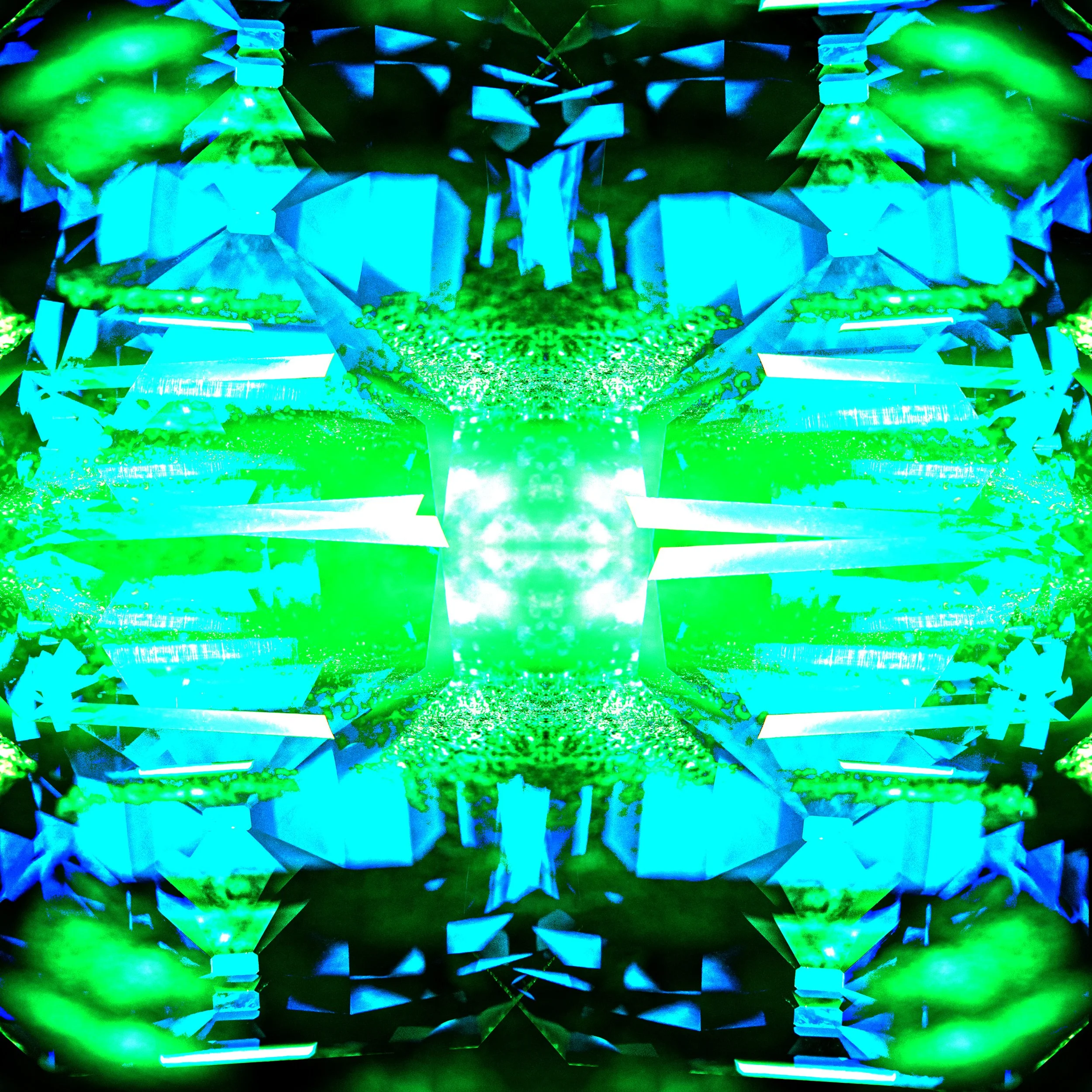
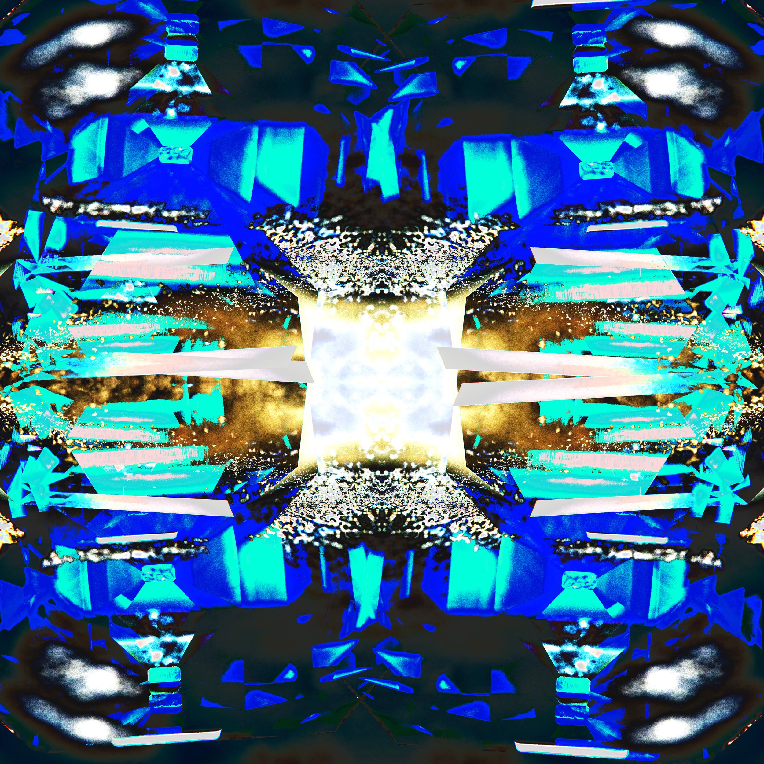
Kelidascope
This exercise was to learn how to use layers and blending modes in Photoshop. It helped to see how each blend mode changed how the image came together.
Compositing
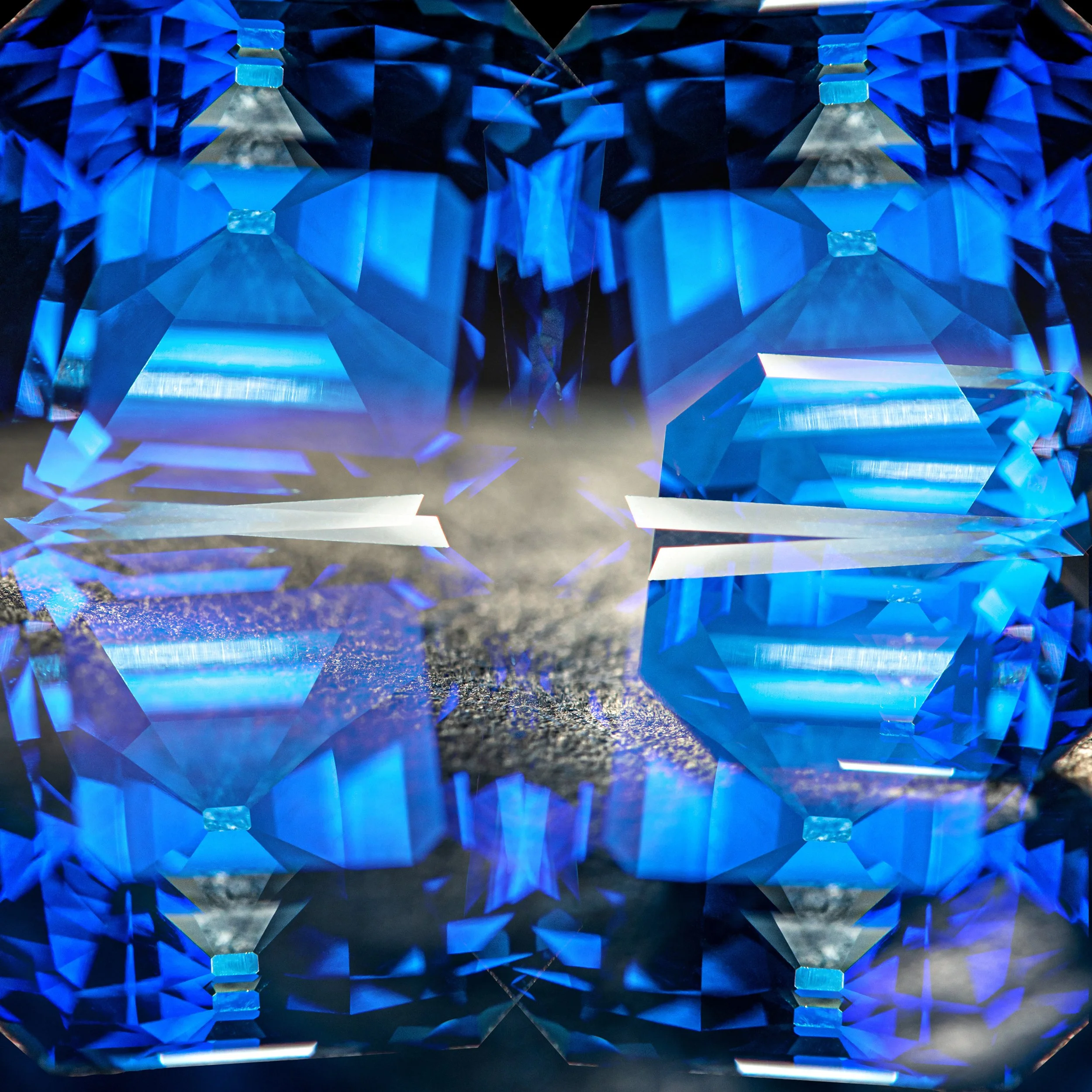
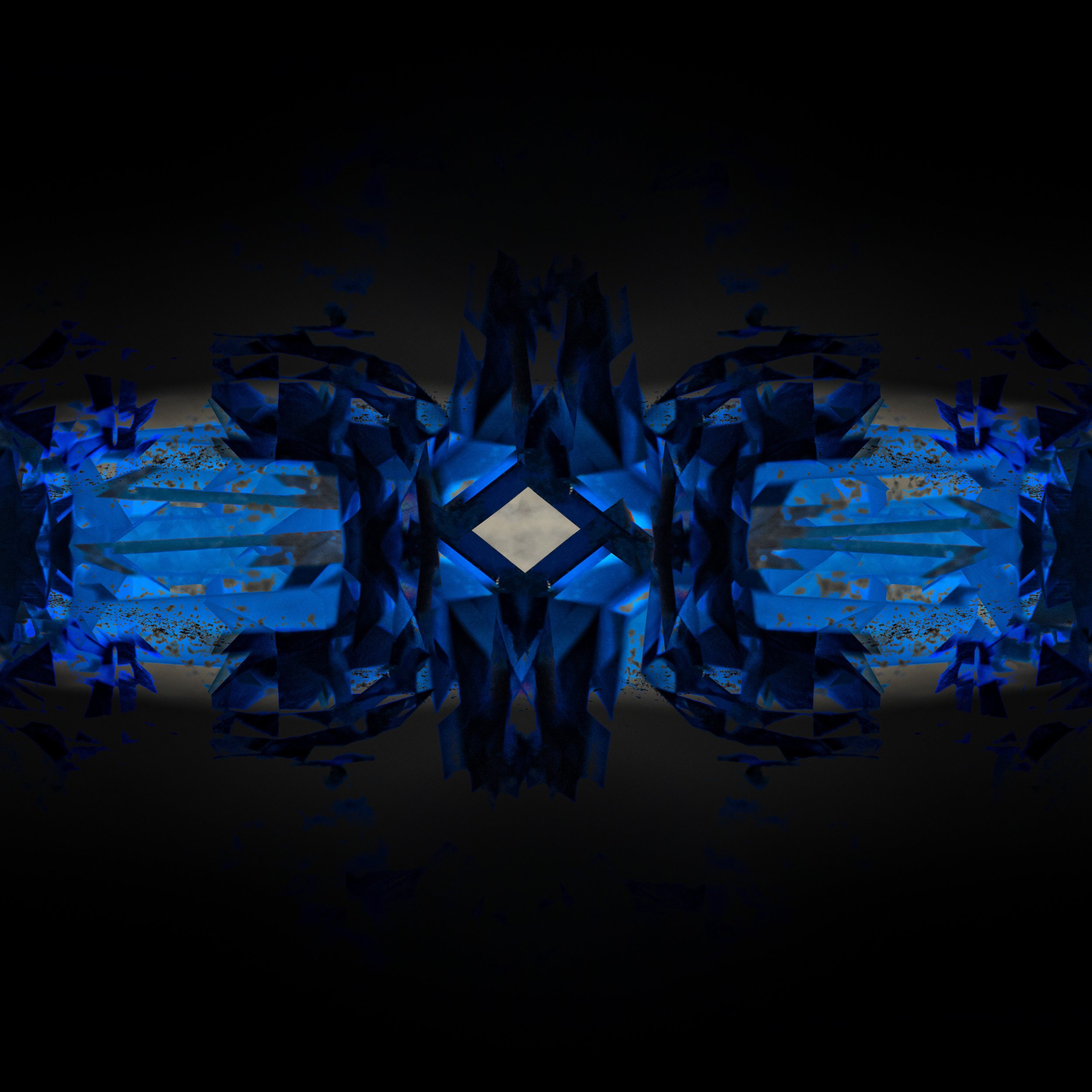
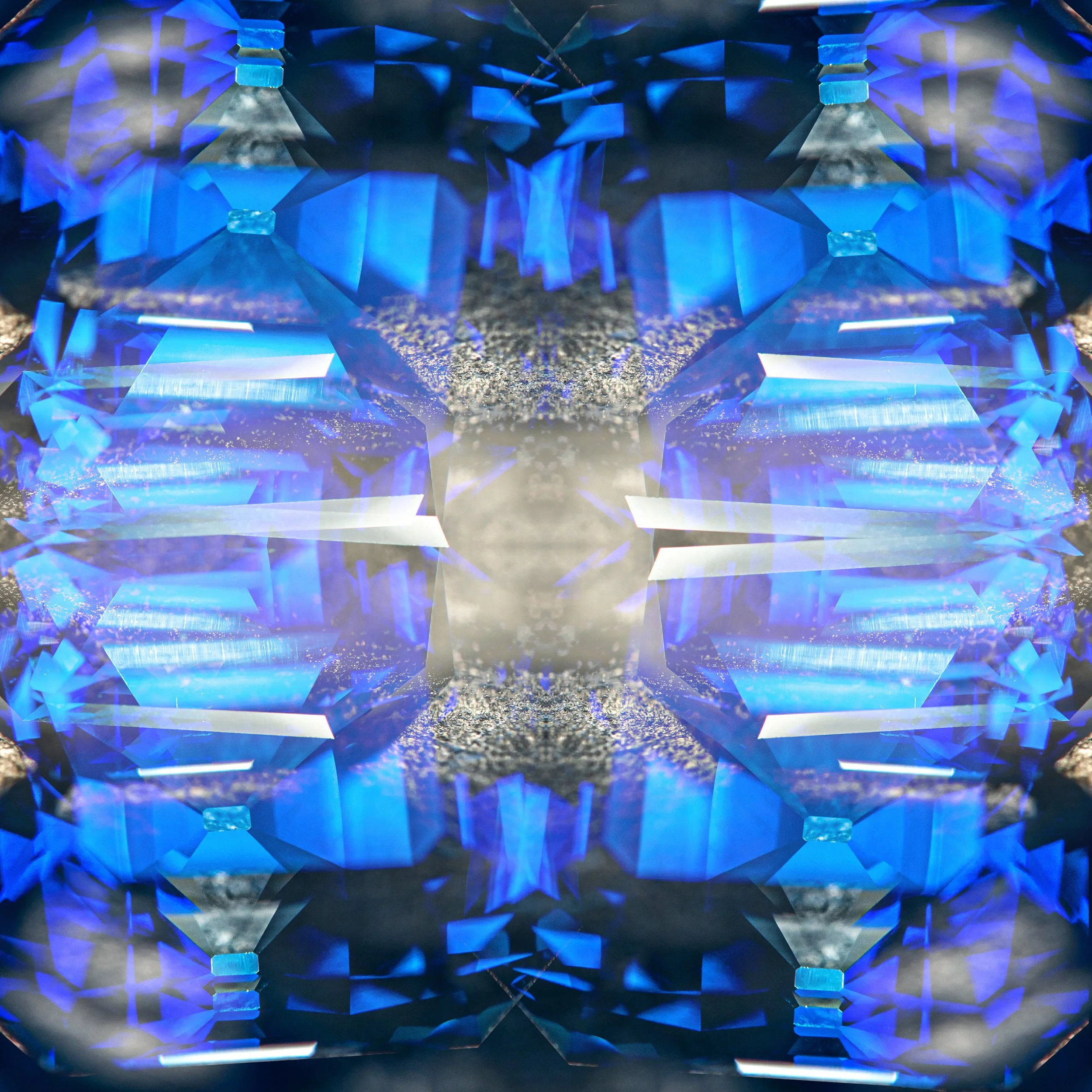
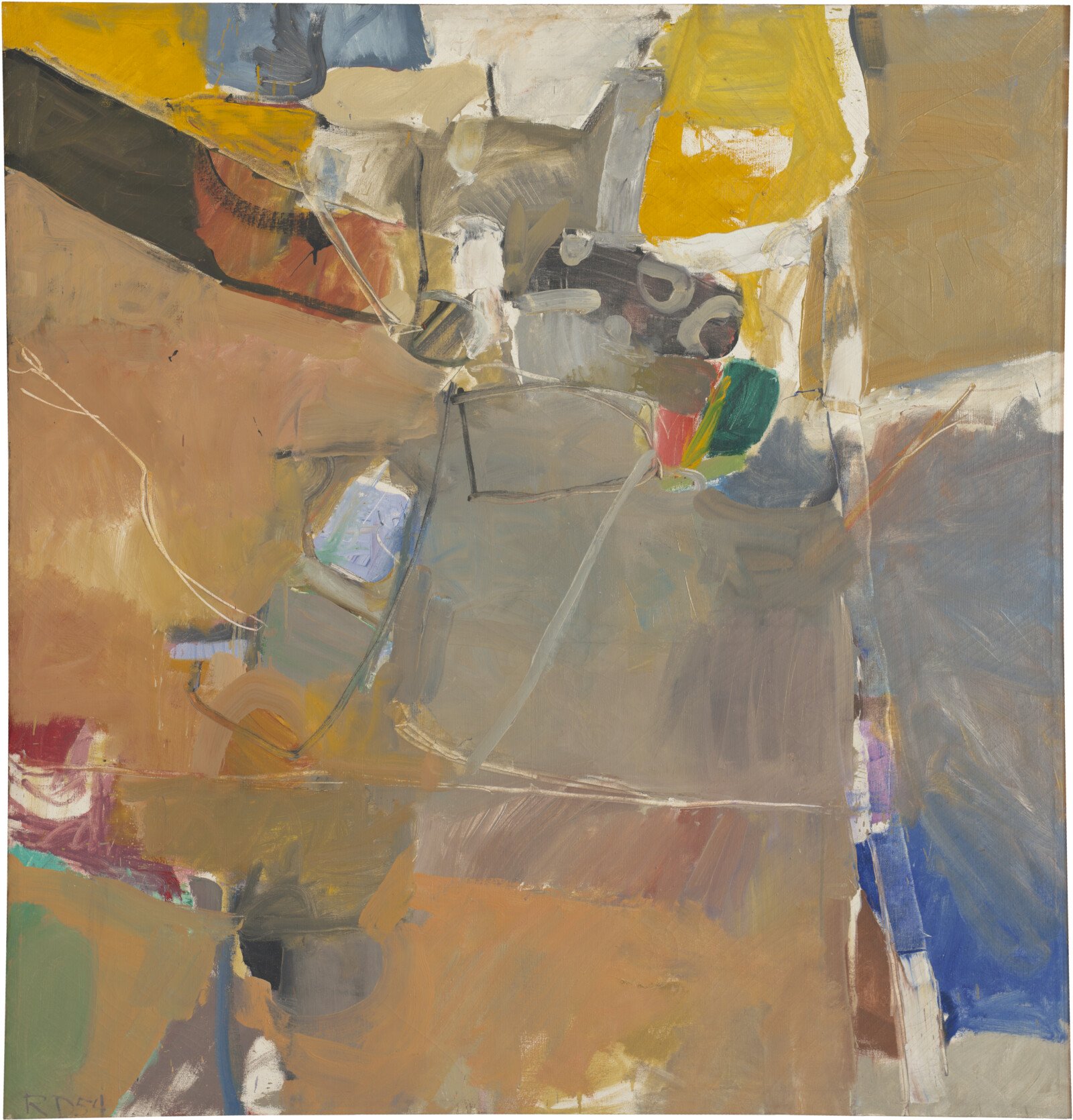
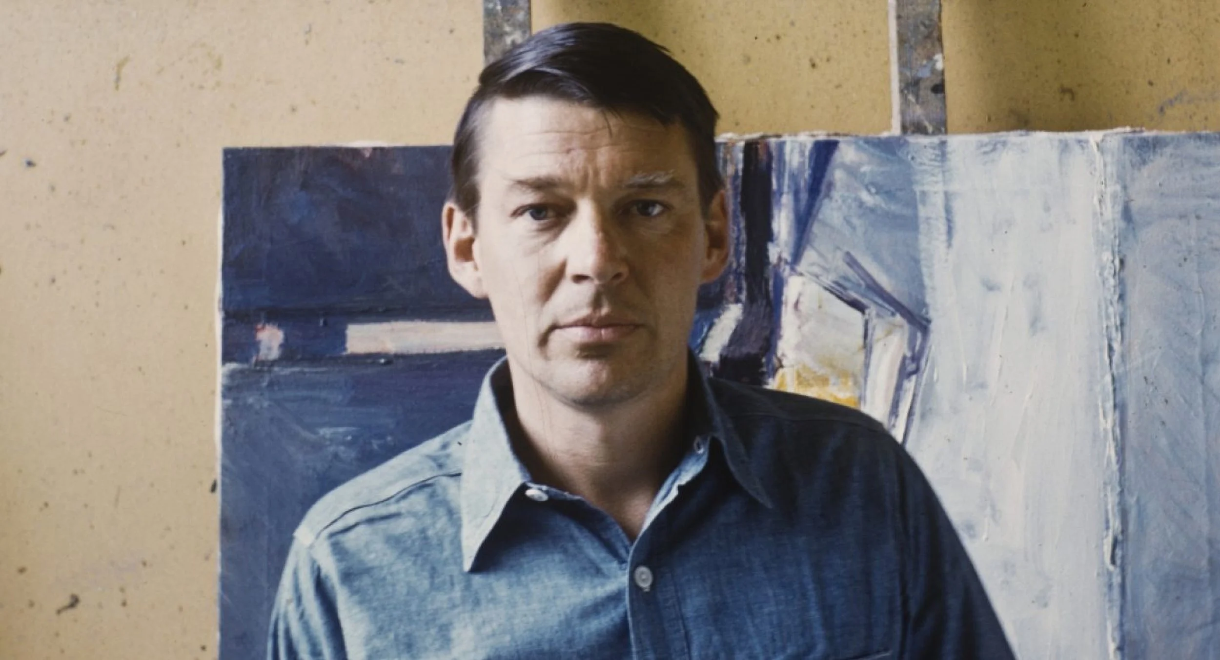
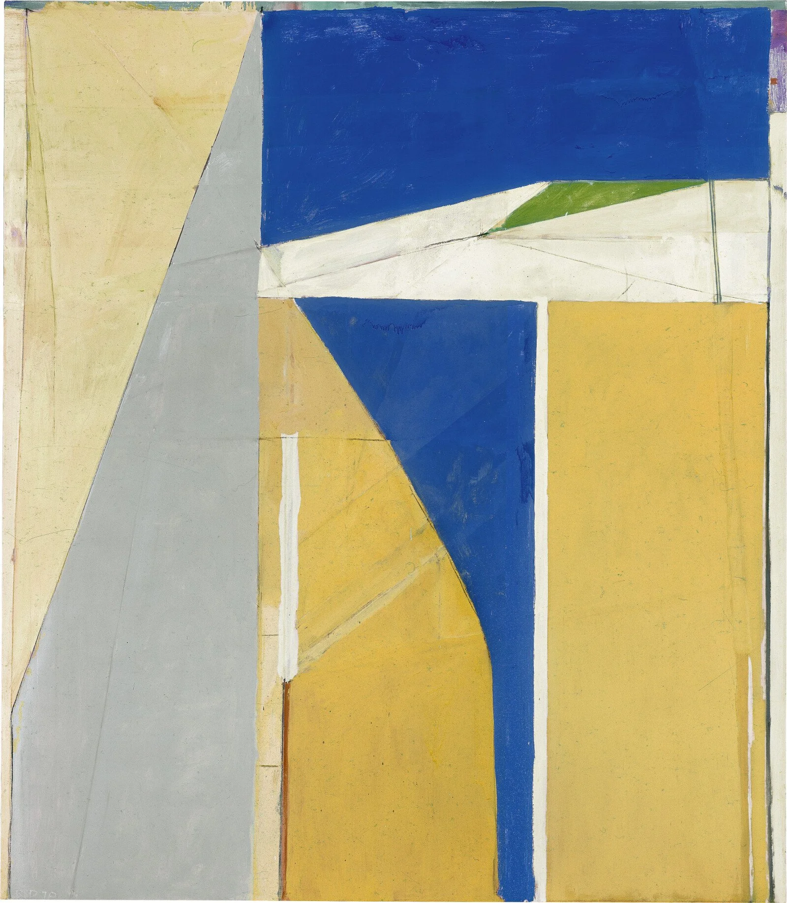
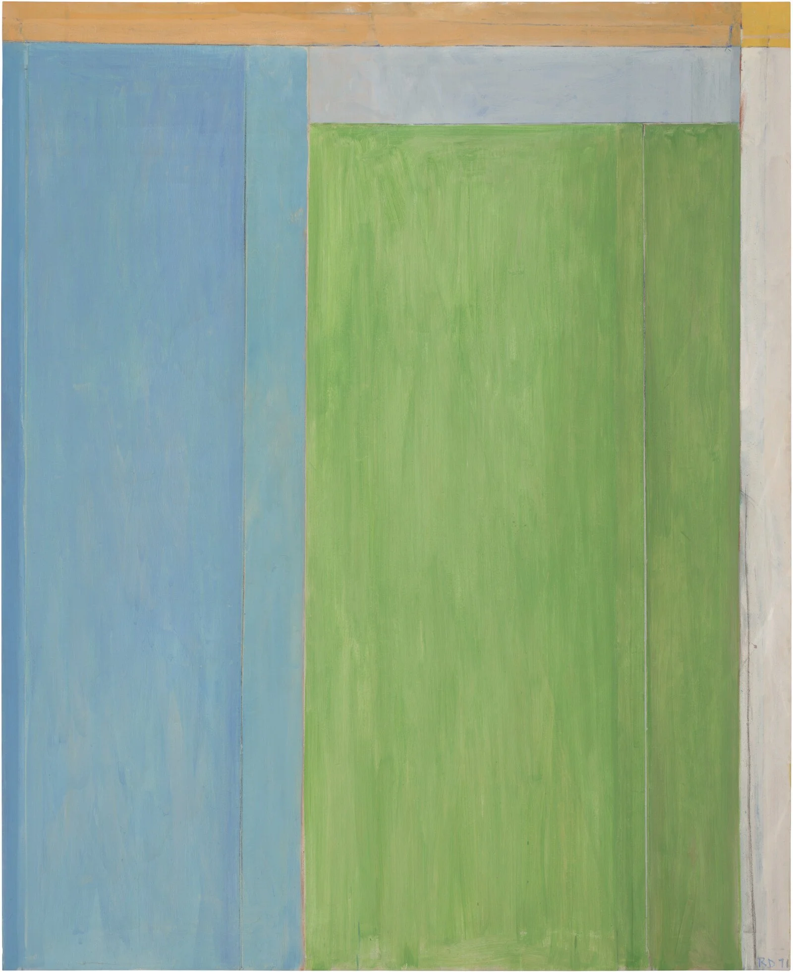
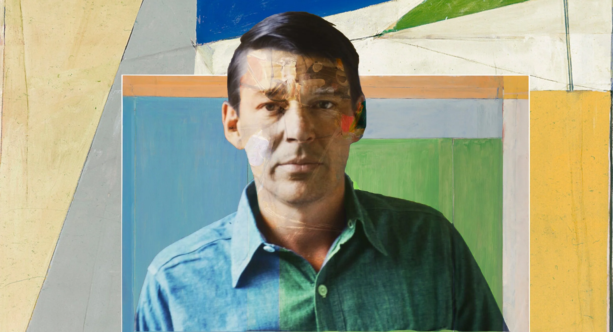
This project combined photography and photo compositing to create an interesting portrait. It was fun to play around with different techniques and get a better grasp the power of Photoshop. It was fun to incorporate the artist’s work into the portrait.
Animation
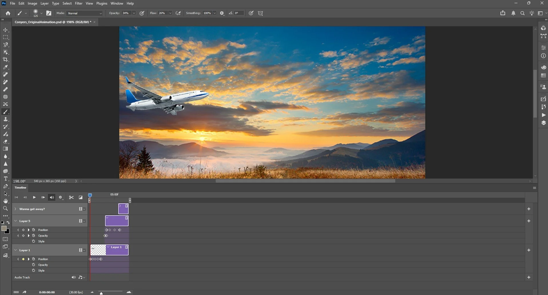
I had no idea that Photoshop had the functionality to create animations. This is something I want to explore more.

Event promotion
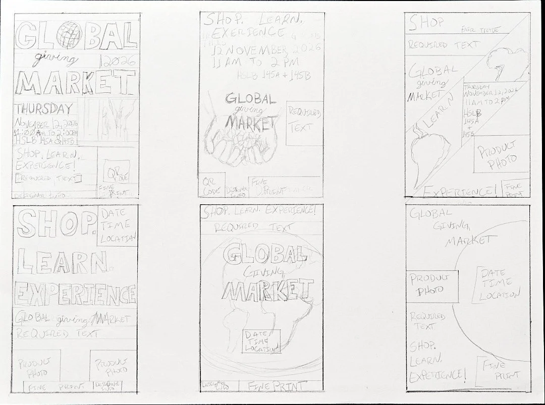
The final project for this course was a service learning project. We were asked to develop a poster and multimedia asset for SERRV International, a non-profit that works with vulnerable populations to help lift them from poverty. My concepts focused on the global aspect of the non-profit and the people who are producing the goods being sold.
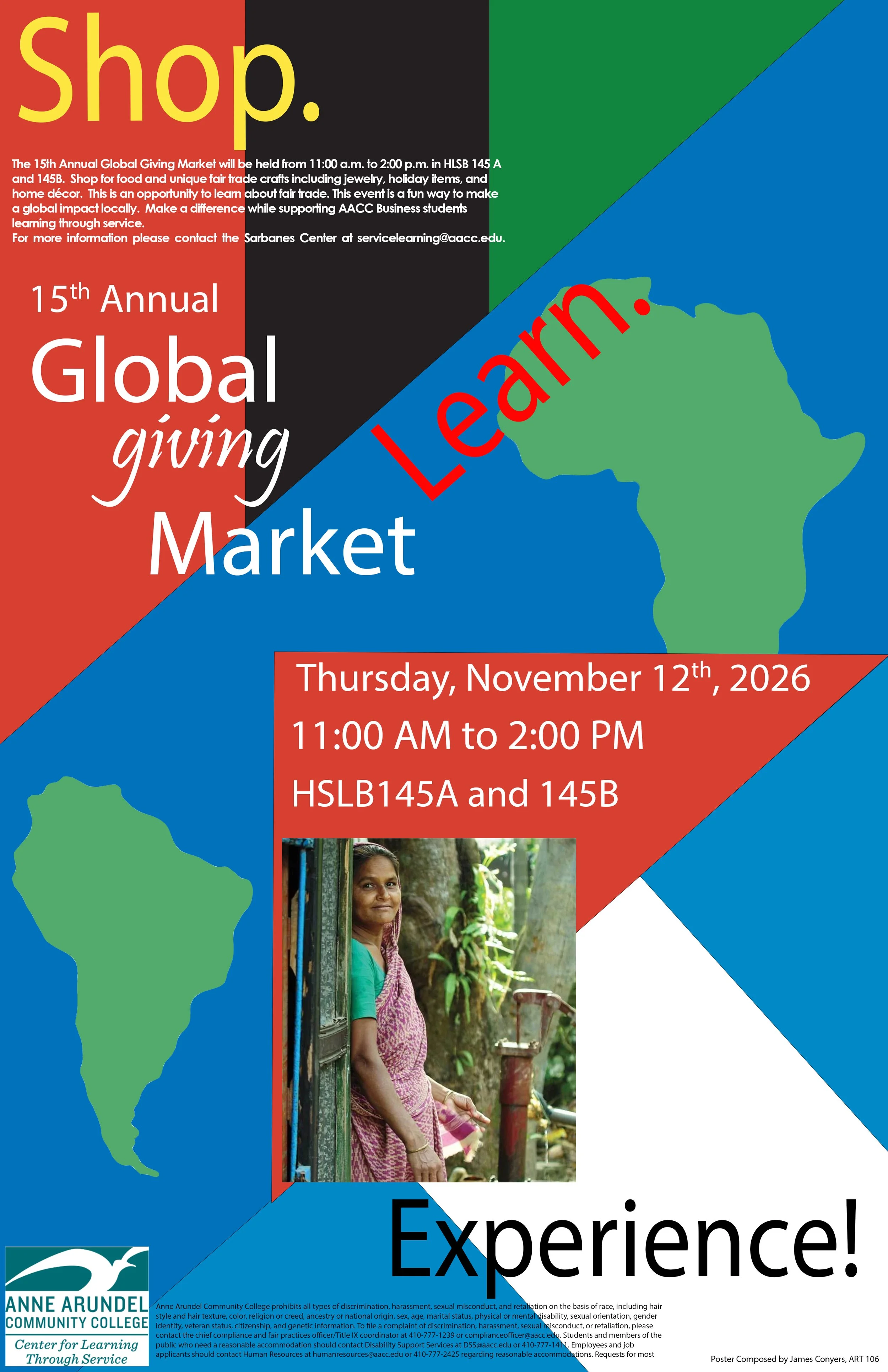
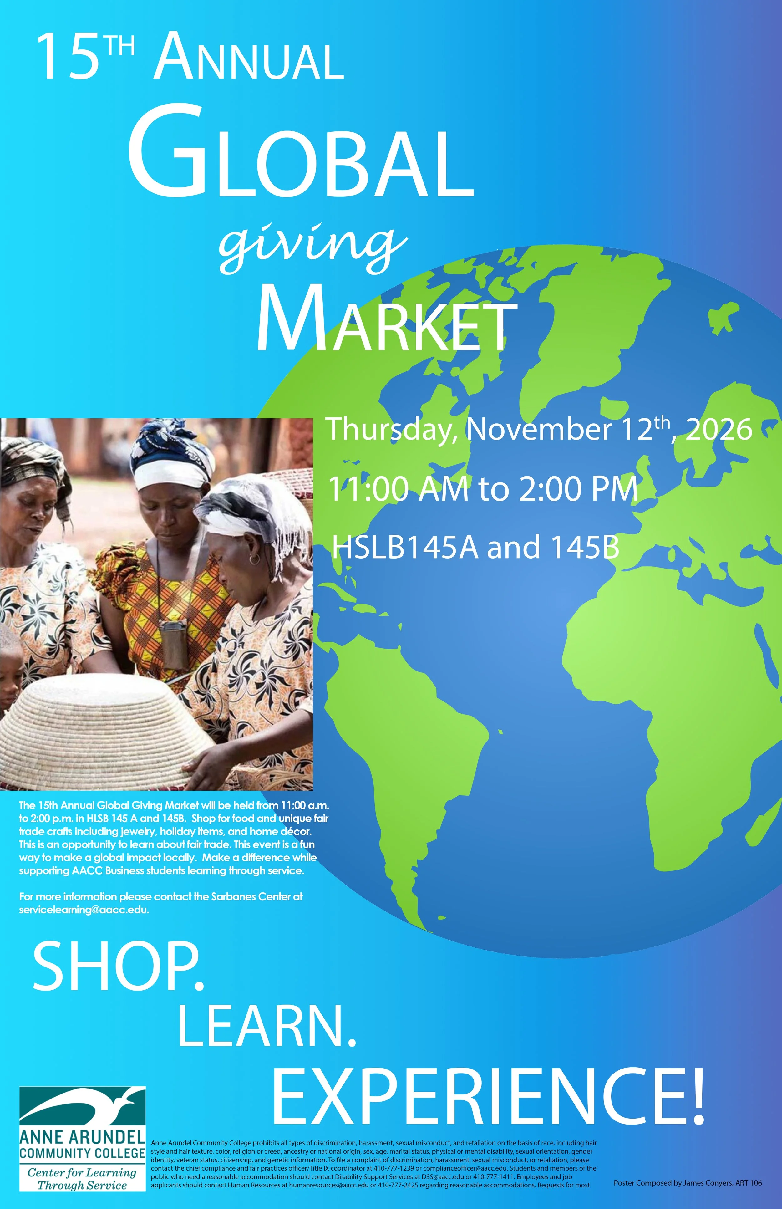
I made a few composites from the sketches above to feel out the layout of the posters. They are quite different in their approach. The one one the left is filled with color and shape to reflect the two continents where the majority of the artisans reside. The poster on the right is more minimalist approach emphasis on the globe.
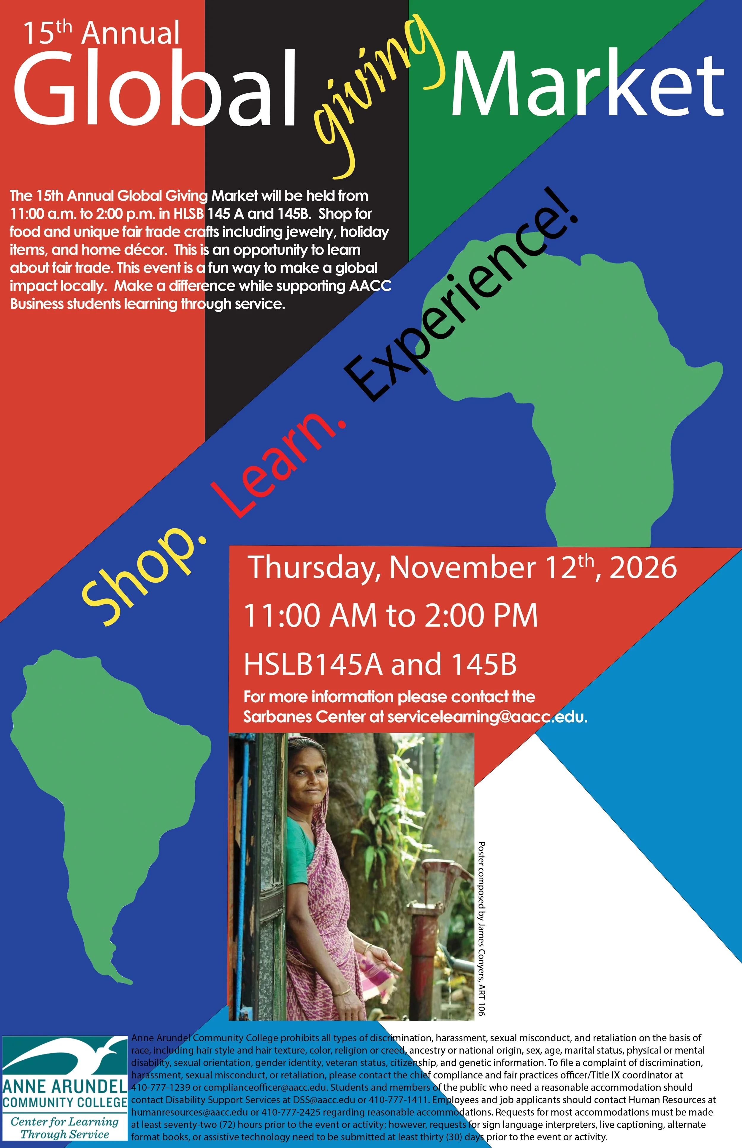
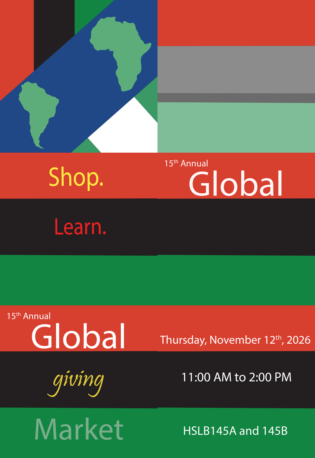
I decided to go with the more colorful poster as it has more movement and holds the viewer in the piece for longer. I used the colors of the Pan-African flag and colors that adorn the flags of many South American nations.
The multimedia asset was created to follow the color scheme and highlighted important details of the event to get it suck in the viewers mind.